
Schedly resources
Branding Schedule Page: Elevate Your Booking Experience
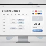
Your booking page is often the first real interaction customers have with your business. At Schedly, we've seen how a generic scheduling interface can tank conversions, while a branded schedule page builds trust instantly.
The difference comes down to design. When your booking experience matches your brand identity, customers feel confident they're in the right place.
What Makes Customers Trust a Booking Page at First Glance
Customers form an opinion about your business in under seven seconds, and your booking page is where that judgment happens. A professional, branded scheduling interface signals competence and reliability, while a generic template screams that you haven't invested in your customer experience. When your booking page matches your brand colors, logo, and typography, customers immediately feel they're dealing with a legitimate, organized business. This consistency matters more than most business owners realize because it's the moment before the sale, not after, when trust in booking page design gets built or destroyed.
Why Generic Booking Pages Kill Conversions
A default scheduling interface works against you in subtle but measurable ways. Customers can't distinguish between a professional service and an amateur operation when the booking experience looks identical to every other business. Your competitors who've invested in branded pages will convert visitors at higher rates because the experience feels intentional and polished. Professional design doesn't just look better-it reduces friction in the booking flow. When a customer navigates a cluttered or confusing scheduling form, they abandon it. Streamlined booking pages with clear calls-to-action, minimal form fields, and transparent pricing convert significantly better than those cluttered with unnecessary steps. The booking form itself should guide customers through appointment selection, information entry, and payment in a logical sequence that feels effortless.
Your Scheduling Page Reflects Your Brand Promise
Your booking interface is where your brand promise meets reality. If you position yourself as modern and innovative, a dated scheduling page contradicts that message immediately. If you're a healthcare provider emphasizing patient care, a cold, corporate booking experience undermines your positioning. Brand consistency across booking interfaces reinforces your brand identity and builds customer confidence. The details matter: a professional font choice, proper spacing, and a cohesive visual hierarchy all contribute to the perception that you run a serious operation. When customers see their booking confirmation email match the branded page they just used, it reinforces legitimacy and makes them more likely to complete the appointment and recommend you to others.
Design Elements That Drive Trust
Color, typography, and logo placement aren't decorative choices-they're trust signals. Customers notice when your scheduling page uses the same visual language as your website and social media. A mismatched booking experience tells customers that different parts of your business operate independently, which erodes confidence. Your logo placement at the top of the page immediately establishes ownership and professionalism. Font choices matter too: serif fonts convey tradition and authority, while sans-serif fonts feel modern and approachable. The spacing between form fields, the size of your call-to-action button, and even the color of your confirmation message all influence how customers perceive your competence. These elements work together to create an experience that feels intentional rather than thrown together.
How Branded Pages Convert Better Than Templates
When you customize your scheduling page to match your brand, you eliminate the mental friction customers experience with generic templates. A customer who sees your logo, colors, and messaging throughout the booking process feels they're interacting with your business, not a third-party service. This psychological connection increases completion rates because customers feel more confident they're making the right choice. Professional booking page conversion rates improve when you streamline the booking flow and reduce friction. Customers who encounter a professional, branded experience are also more likely to return for future bookings and refer others to your business. The investment in customization pays dividends because it transforms your booking page from a necessary evil into a marketing asset that actively sells your services.
Now that you understand how design builds trust, the next step is learning exactly which customization choices move customers from hesitation to booking.
Building Your Branded Booking Experience
Start with your visual identity, not your booking form. Your colors, logo, and typeface should appear consistently across every element of the scheduling page before customers see a single form field. When a fitness studio uses the same burnt orange and cream palette on their booking page as they do in their studio and social media, clients recognize the business instantly. The logo should sit prominently at the top of the page, not tucked away in a footer. Your font choice carries weight too-a legal firm using serif fonts like Garamond conveys tradition and stability, while a modern design agency using clean sans-serif fonts like Inter or Roboto signals innovation. These aren't aesthetic details; they're recognition signals that reduce cognitive friction. Visual consistency across your booking page and website creates stronger brand recognition and better customer experiences.
The Booking Form Should Disappear Into Your Brand
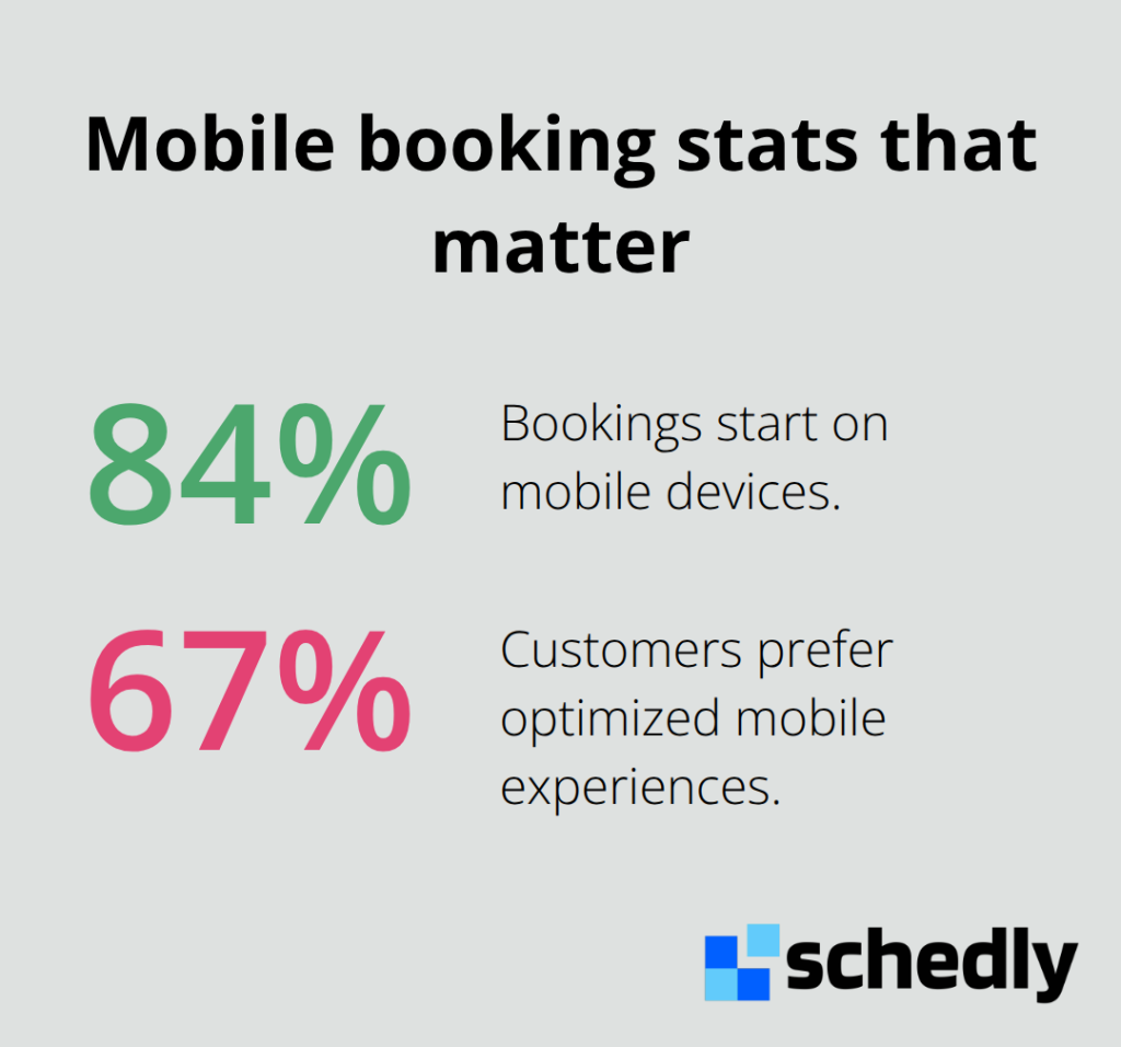
Eliminate every unnecessary form field and question. A common mistake is asking for information you don't actually need at booking time-save secondary details for post-confirmation emails. Your form should request only essentials: name, contact information, service selection, and date/time preference. Each field needs clear labeling with straightforward language, no jargon. Visual hierarchy guides customers through the process: larger text for the service name, clear spacing between sections, and a prominent call-to-action button that stands out from your background. The button text matters-use action-oriented language like "Book Now" or "Schedule Your Session" rather than generic "Submit." Mobile optimization for booking forms is essential: 84% of bookings start on mobile devices, and 67% of customers prefer optimized mobile experiences.
Social Proof Converts Hesitant Customers Into Bookers
Display customer testimonials directly on your booking page, not buried elsewhere on your website. A healthcare clinic that shows patient reviews mentioning Dr. Sarah's expertise and calm demeanor on the scheduling page increases appointment confirmations because potential patients gain confidence before committing. Testimonials should be specific and attributed: include the customer's name, their role or context, and what they actually experienced, not generic praise. Video testimonials outperform written ones because they feel authentic and human. A 30-second clip of a satisfied client speaking genuinely about their experience carries more weight than polished marketing copy. Star ratings matter too-display your average rating prominently if it's 4.5 stars or higher. If your rating is lower, focus on improving your service and collecting more recent reviews rather than hiding the metric. Social proof through customer testimonials significantly impacts conversion rates. Post-booking reminders should include past client testimonials in confirmation emails to reinforce the decision and reduce no-shows. Some booking platforms let you display the number of successful bookings completed, which acts as social proof through volume: seeing that clients have already booked through your page creates a sense of legitimacy and popularity.
What Happens When Customers Complete Their Booking
Once a customer clicks that final confirmation button, your work shifts from conversion to retention. The confirmation email they receive should match the branded experience they just completed-same colors, same logo, same professional tone. This consistency reinforces their decision and makes them feel confident about their upcoming appointment. Automated reminders sent via email or SMS (with the customer's permission) reduce no-shows significantly and keep your business top-of-mind. These touchpoints represent your next opportunity to strengthen the relationship and set expectations for what happens next.
How Branded Booking Pages Drive Real Business Results
Fitness Studios Convert More Class Bookings With Branded Scheduling
Fitness studios that implement branded scheduling pages see measurable increases in class bookings because the experience feels like an extension of their studio identity, not a third-party tool. A boutique studio using their signature color palette and studio photography on their booking page creates immediate recognition that reduces decision friction. When customers see the same aesthetic they encountered on Instagram, the studio website, and now the booking interface, they move from consideration to confirmation faster. Consistency builds familiarity, and familiarity builds trust. Studios that leave their booking page generic report higher abandonment rates because customers question whether they're booking with the right business.
One critical detail most studios miss is displaying class capacity and instructor names directly on the booking page. Customers want to know if their favorite instructor teaches the class before committing, and when this information appears prominently alongside your branded design, conversion rates improve substantially. Payment flexibility matters too-offering multiple payment methods (credit cards, PayPal, Apple Pay) on a branded checkout page reduces cart abandonment because customers can pay using their preferred method without friction.
Legal Firms Establish Authority Through Professional Design
Legal firms gain significant credibility advantages through professional booking page design because scheduling with a lawyer requires confidence in expertise and trustworthiness. A firm that displays attorney credentials and years of experience directly on the booking page establishes authority before the first consultation happens. The visual design itself communicates professionalism: serif typography, conservative color schemes, and clear service descriptions signal that this is a serious operation.
Potential clients evaluate whether this firm understands their needs and can be trusted with sensitive legal matters. A branded booking page that maintains consistency with the firm's website and marketing materials reinforces this perception of competence and stability.
Healthcare Providers Build Patient Confidence With Consistent Branding
Healthcare providers face similar dynamics but with higher stakes. When a patient books their first appointment with a new doctor, they evaluate whether this provider understands their needs and can be trusted with sensitive health information. A branded booking page that displays patient testimonials mentioning specific outcomes significantly increases appointment completion rates.
Providers should show average wait times, accepted insurance plans, and telemedicine availability directly on the scheduling page because patients want these answers before booking, not after. One provider increased new patient bookings by clarifying their cancellation policy and showing a 48-hour cancellation deadline on the booking page itself, which reduced no-shows dramatically. The confirmation email following a successful booking should maintain the same branded experience, including the practice logo, color scheme, and a clear statement about what to bring to the appointment. This consistency transforms the booking experience from a transactional moment into a relationship-building touchpoint that prepares patients for their visit and reinforces their decision to choose your practice.
Final Thoughts
Your branding schedule page isn't a nice-to-have feature-it's a competitive necessity. Every fitness studio, legal firm, and healthcare provider that invests in branded scheduling pulls ahead of competitors still using generic templates. The businesses converting more customers aren't doing anything complicated; they simply ensure that the moment customers land on their booking page, they see the same professional identity they encountered on social media, your website, and your marketing materials.
Customers spend seconds evaluating whether your business is legitimate and trustworthy, and your booking experience determines that judgment. A generic page signals indifference to customer experience, while a branded page signals that you've invested in every detail of your business, including the moment customers commit to working with you. Consistency across your colors, logo, typography, and messaging moves customers from hesitation to confirmation faster, reduces abandoned bookings, and increases appointment attendance.
We at Schedly built our scheduling software specifically for businesses that understand this value. Visit Schedly to create a fully branded scheduling page that matches your business identity while automating the entire booking process.