
Schedly resources
Data Visualization Dashboards For Clearer Insights
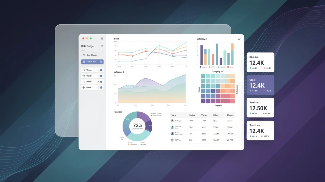
Most companies sit on mountains of data but struggle to see what it actually means. Data visualization dashboards cut through the noise by turning numbers into clear, visual stories that your team can act on immediately.
At Schedly, we've seen firsthand how the right dashboard transforms how organizations make decisions. When your metrics are visible and organized, spotting opportunities and problems becomes second nature.
Why Dashboards Turn Data Into Action
Raw numbers sit in spreadsheets and databases, disconnected from the people who need to act on them. Dashboards close that gap by organizing metrics into a single view that tells a coherent story. When Florence Nightingale visualized Crimean War hospital deaths in the 1800s, she didn't just present statistics-she arranged them to prove that unsanitary conditions killed more soldiers than combat. Hospital leadership saw the data, understood the problem, and reformed practices. That's the power of visualization: it moves people from confusion to conviction.
Today, dashboards work the same way. Instead of asking managers to parse spreadsheets for hours, you present trends, outliers, and patterns in seconds. Data visualization speeds up decision-making. A sales dashboard showing pipeline velocity reveals which deals are stalling. An operations dashboard displaying real-time metrics flags bottlenecks before they cascade into missed deadlines. The difference between a spreadsheet and a dashboard isn't just appearance-it's speed and clarity.
Numbers Become Visible Faster
Decision-making stalls when people hunt for information. The 5-second rule applies to dashboards: if someone can't grasp your main message within five seconds, your design has failed. Executives reviewing quarterly performance don't have time for complicated charts or buried context. They need KPIs front and center with prior-period comparisons and targets visible at a glance.
When your metrics are governed with clear formulas and owners-everyone interprets them the same way. This eliminates the frustrating situation where sales reports one number and finance reports another. A semantic layer or certified metrics system ensures consistency across all dashboards, which speeds approval cycles and reduces rework. Teams stop debating what the numbers mean and start debating what to do about them.
Patterns Hide in Plain Sight Until Visualized
John Snow's 1854 cholera map didn't just show deaths-it clustered them geographically around a single water pump, pinpointing the source in seconds. Without visualization, the pattern would have remained invisible in a mortality table. Modern dashboards reveal similar hidden patterns through interactive filtering and drill-down capabilities.
A treemap of budget allocation shows which departments consume the most resources in a single view. Line charts expose seasonal trends that raw monthly figures obscure. Color coding and spatial layout guide attention to what matters most. The interactive elements matter too: hover tooltips let analysts explore specific data points, filters enable cross-cutting analysis across regions or products, and drill-downs reveal whether a trend stems from volume shifts or price changes. This capability transforms passive reporting into active exploration, where insights emerge from questions your team actually asks.
Interactive Exploration Uncovers What Static Reports Miss
Static reports lock data in place. Dashboards let your team ask questions and find answers without waiting for someone else to rebuild a spreadsheet. When a manager filters a sales dashboard by region, they spot which territories underperform. When an analyst clicks into a revenue chart, they see whether growth came from new customers or increased spending from existing ones. This interactivity shifts power from report creators to report users, accelerating the path from observation to action.
What Makes a Dashboard Actually Useful
Effective dashboards share three non-negotiable characteristics: they update frequently enough to matter, they display exactly what your team needs without clutter, and they let people explore data instead of passively reading reports. A dashboard that refreshes once a day fails an operations manager who needs to spot production delays in real time. A dashboard packed with fifty metrics overwhelms rather than clarifies. A dashboard that only shows pre-built charts forces analysts to request custom reports instead of answering their own questions. The best dashboards balance speed, relevance, and flexibility.
Real-Time Visibility Beats Yesterday's Data
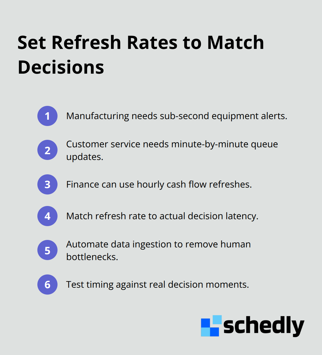
Operational dashboards need real-time or streaming updates depending on your industry. Manufacturing plants monitoring equipment temperature require sub-second alerts to prevent equipment failure. Customer service teams tracking queue depth need minute-by-minute updates to staff appropriately. Finance teams reviewing cash flow can accept hourly refreshes. The wrong cadence wastes money and delays action.
Customization Prevents Information Overload
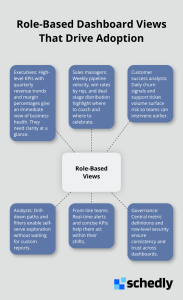
One dashboard cannot serve everyone equally. An executive needs quarterly revenue trends and margin percentages. A sales manager needs weekly pipeline velocity and win rates by rep.
Interactivity Shifts Analysis From Waiting to Doing
Static reports answer questions someone predicted you would ask. Dashboards with filters, hover tooltips, and drill-down paths let your team ask unexpected questions and find answers immediately. A manager filtering a performance dashboard by region spots which territories underperform without requesting a custom report. An analyst clicking into a revenue chart discovers whether growth came from volume or price without waiting three days. This interactivity accelerates insights from observation to action. Interactive features also improve engagement. Teams spend more time exploring dashboards when they can manipulate them versus passively reading a report. The Washington Post's eclipse visualization maps totality paths through 2080 and shows lifetime eclipse counts by birth year-users don't just read the facts, they interact with them to answer personal questions. Dashboards should enable similar exploration within your business context. Build filters for dimensions your team actually questions: region, product line, customer segment, time period. Skip filters nobody uses. Test with end users to identify which interactive elements drive decisions versus which clutter the interface. The next chapter covers how to select the right visualization types to match your data and audience needs.
Building Dashboards That Actually Get Used
Define KPIs Before You Touch Your Data
Start with your KPIs, not your data. Too many teams reverse this order-they examine available data and try to construct a dashboard around it. This produces bloated dashboards that measure everything but clarify nothing. Instead, identify what decisions your team makes and what metrics inform those decisions. A sales manager decides whether to coach a rep, reassign accounts, or celebrate wins. That requires pipeline velocity, win rate by rep, and deal stage distribution-nothing more. An operations manager decides whether to hire, adjust shifts, or investigate a process. That requires queue depth, average handle time, and abandonment rate.
Write down these decisions first. Then identify the metrics that truly matter. This constraint forces clarity. If you cannot explain why a metric belongs on a dashboard, it does not. Dashboards with fewer than eight metrics drive faster decisions than those packed with twenty. Governed metrics-defined once with clear formulas, ownership, and targets-eliminate arguments about what numbers mean. A semantic layer ensures sales and finance agree on revenue definition, accelerating sign-off and reducing rework.
Test your KPI choices with actual users before you build visuals. Ask them to make a decision using only your proposed metrics. If they need additional data, add it. If they ignore a metric, remove it. This validation prevents wasted design effort and guarantees adoption.
Choose Visualization Types That Match Your Data
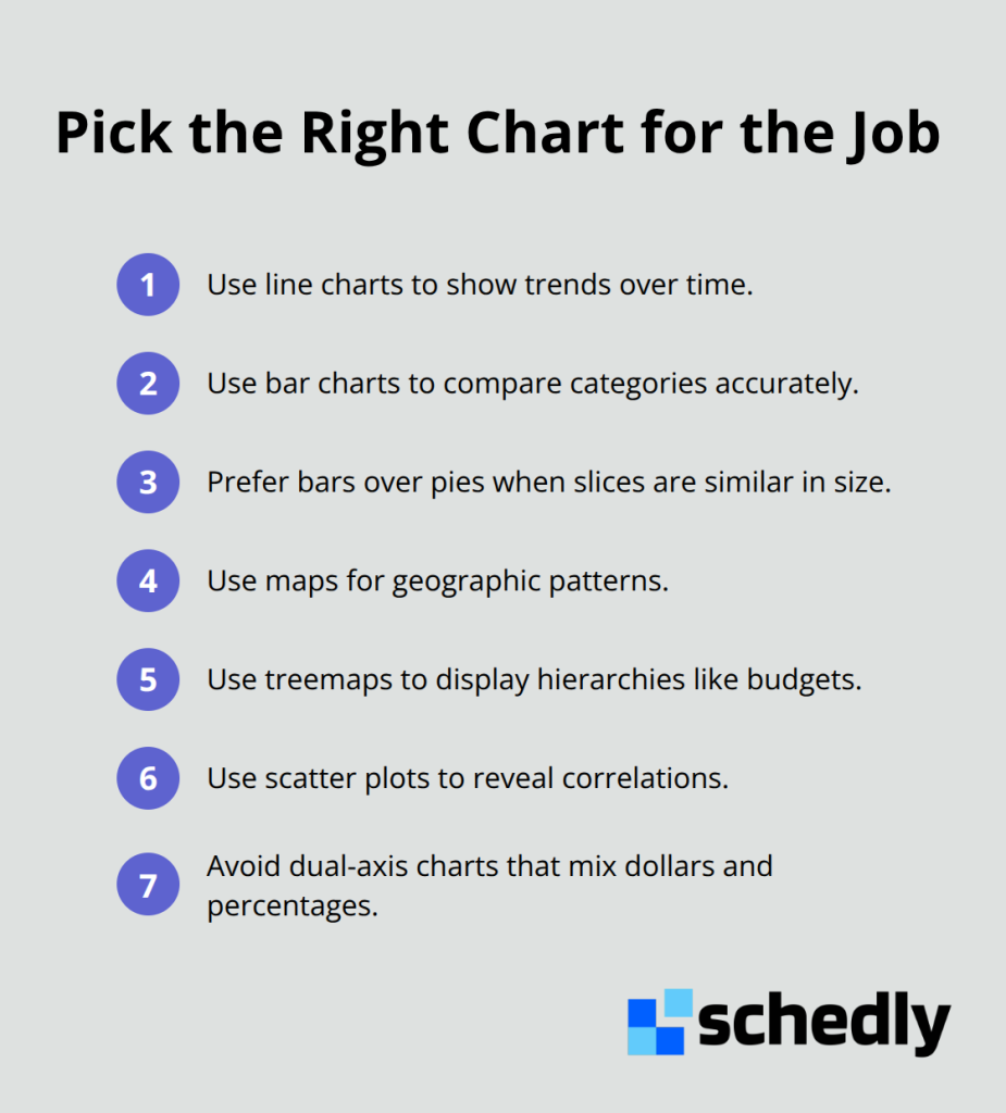
Visualization type matters more than aesthetics. Line charts show trends over time better than bar charts because the human eye tracks slopes faster than comparing bar heights. Bar charts compare categories more effectively than pie charts-pie slices misread by up to 20 percent when segments are similar in size, while bar comparisons stay accurate.
Color should encode data, not serve as decoration. If your dashboard has ten products, use ten distinct colors. If you show performance against target, use red for below-target and green for above-target. Neutral audiences interpret these conventions instantly. Test your color choices with color-blind users-roughly 8 percent of men and 0.5 percent of women have color blindness, and your dashboard may become unreadable without sufficient contrast.
Simplify Layout and Remove Clutter
Place the most important metric top-left where eyes land first. Use consistent spacing and alignment so viewers focus on data, not design. The 5-second rule applies to every dashboard: if someone cannot understand the main story in five seconds, redesign. Clutter kills clarity. Remove decorative elements, simplify axis labels, and eliminate redundant information. If a metric appears in text and in a chart, keep only the chart.
Test your draft with five people who do not know what the dashboard should show. Ask them to spend five seconds looking, then describe what they see. If they miss your main point, you need to redesign. This feedback loop catches problems before you deploy the dashboard to your entire organization.
Validate With Real Users
Interactive elements matter only if people actually use them. Filters, hover tooltips, and drill-down paths should answer questions your team actually asks. A manager filtering a performance dashboard by region spots which territories underperform without requesting a custom report. An analyst clicking into a revenue chart discovers whether growth came from volume or price without waiting three days.
Build filters for dimensions your team questions: region, product line, customer segment, time period. Skip filters nobody uses. Test with end users to identify which interactive elements drive decisions versus which clutter the interface. The difference between a dashboard that gets used and one that gathers dust often comes down to whether it answers the questions people actually have.
Final Thoughts
Dashboards transform how organizations operate when teams stop hunting for data and start seeing it instantly. Decisions accelerate and outcomes improve when your organization acts on information faster than competitors. The companies winning in their markets aren't those with the most data-they're the ones who see their data fastest and respond to it first.
Technical tools matter far less than discipline in defining what matters before designing anything. You must choose visualizations that match your data, test ruthlessly with actual users, and validate that your design answers real questions. Pick a platform that fits your team's skill level and budget, then focus your energy on the fundamentals: real-time updates beat stale data, role-based views beat one-size-fits-all dashboards, and interactive exploration beats static reports.
Start small with one critical decision your organization makes repeatedly-sales pipeline velocity, customer churn, operational efficiency, whatever drives your business. Build a data visualization dashboard around that single decision, gather feedback, and iterate until your team reaches for it daily. Scheduling software like Schedly includes analytics dashboards that help businesses track key metrics and make data-driven decisions about staffing, customer demand, and resource allocation using the same principles of clarity, real-time visibility, and role-based customization.