
Schedly resources
Data Visualization for Scheduling: From Insights to Actions

Most scheduling managers rely on gut feeling instead of actual data. This costs time, creates bottlenecks, and leads to poor resource decisions.
Data visualization for scheduling changes that. When you can see your booking patterns, employee availability, and peak demand hours in clear charts and dashboards, you stop guessing and start acting. At Schedly, we've seen teams cut scheduling errors by half simply by switching to visual metrics.
Why Visual Dashboards Beat Spreadsheets
Spreadsheets kill your scheduling decisions. Most teams track employee availability, booking patterns, and peak demand hours in static Excel files updated every few days or weeks. This delay costs money. When data fragmentation hampers urgent decision-making, you lose the ability to respond to real-time changes. Real-time integration improves responsiveness by showing you exactly what's happening now, not what happened last Tuesday. Advanced analytics dashboards transform raw scheduling data into visual metrics you can act on immediately. The shift toward interactive, dynamic scheduling visuals rather than static reports isn't a trend-it's a necessity. Teams that visualize booking density through calendar heat maps spot bottlenecks within minutes instead of hours. Performance charts reveal scheduling efficiency gaps that spreadsheets hide. When you see your data visually, you stop explaining problems and start fixing them.
Bottlenecks Become Obvious
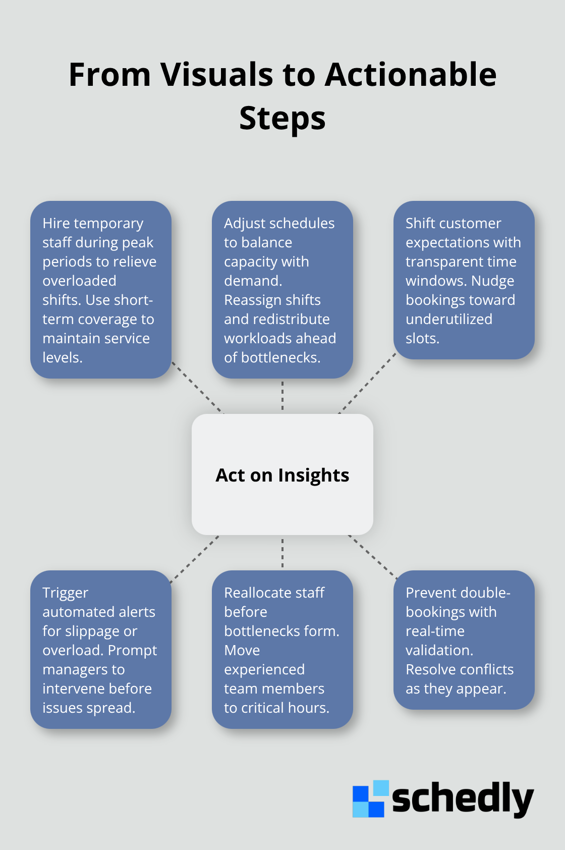
A heat map showing your busiest hours and underutilized time slots tells you more than any number in a cell ever could. You instantly identify which days are overbooked, which employees are stretched thin, and where customer demand outpaces your capacity. This visual clarity forces action-you either hire temporary staff, adjust schedules, or shift customer expectations. The alternative is continuing to miss patterns that cost you money. Small, bite-sized scheduling metrics like daily task counts and on-time percentages are easier to interpret and act on than raw spreadsheets.
Speed Matters More Than Perfection
Real-time metrics enable faster decision-making because you don't wait for reports to compile or data to sync. The moment a key employee calls in sick, your dashboard shows you the ripple effect across that day's schedule. The moment demand spikes, you see which time slots are filling fastest. Fast decisions beat perfect decisions in scheduling. Data visualization acts as a competitive differentiator. Clear data presentation also reduces scheduling errors naturally-when everyone sees the same visual truth about availability and demand, miscommunications drop. A single source of truth for planning, execution, and forecasting improves cross-team visibility and accountability. Your team stops arguing about whether a resource is actually available and starts debating how to use that resource better.
From Data to Action
Visual dashboards don't just show you problems-they show you where to act first. Heat maps highlight which shifts need coverage, which customers book during specific windows, and which resources sit idle while others overflow. Performance charts reveal patterns that spreadsheets bury. When your team sees these visuals daily, scheduling decisions shift from reactive to proactive. You anticipate demand spikes instead of scrambling when they hit. You reallocate staff before bottlenecks form. You catch double-bookings before customers arrive. This transition from static reporting to dynamic, self-serve insights changes how your entire team approaches scheduling. The next step is learning which specific metrics matter most for your business and how to track them consistently.
What Metrics Actually Drive Better Scheduling Decisions
Employee Utilization Reveals True Capacity
Employee utilization rates sit at the heart of smart scheduling. You need to know exactly how many hours each team member works against their available capacity each week. Track this metric directly in your scheduling system rather than calculating it manually from timesheets. When you see that one employee averages 28 billable hours weekly while another hits 38, you spot the gap immediately. This isn't about working people harder-it's about identifying who has genuine availability for new bookings and who doesn't. Staff stretched to capacity will make scheduling mistakes, miss deadlines, and eventually burn out. Your analytics dashboard should show utilization patterns across your entire team, revealing which employees consistently have open slots and which ones need help. The practical next step is assigning new bookings to people with actual capacity rather than hoping it works out.
Demand Patterns Shape Your Entire Strategy
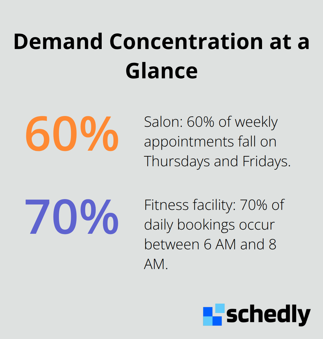
Demand patterns determine your entire scheduling strategy, yet most teams never analyze them properly. Pull your booking data from the last twelve months and identify which days, times, and seasons drive the highest customer demand. If your salon books 60 percent of weekly appointments on Thursdays and Fridays, you must staff those days differently than Mondays. If your consulting business sees demand spikes in Q4, your team needs to build availability then, not scramble when clients call. Look at hour-by-hour patterns too-many service businesses experience concentrated demand in narrow windows. A fitness facility might see 70 percent of daily bookings between 6 AM and 8 AM, meaning your most experienced trainers should anchor those slots.
Seasonal Analysis Prevents Reactive Chaos
Seasonal analysis matters equally to daily patterns. Analyze your peak seasons against staffing levels from those periods and identify what worked. Did you hire temporary staff? Contract with freelancers? Adjust pricing to manage demand? Document the approach that actually reduced bottlenecks and customer wait times. When demand spikes again, you'll execute the proven strategy instead of improvising. This data-driven approach prevents the reactive chaos that destroys scheduling quality and customer satisfaction. Once you understand these three metrics-utilization, demand patterns, and seasonal trends-you're ready to translate them into visual formats that your team can act on immediately.
Which Visualization Tools Actually Work for Scheduling
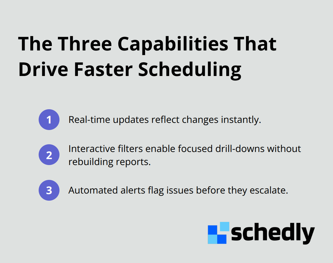
Heat maps and performance charts sound impressive in theory, but most scheduling tools offer weak visualization features that fail to translate into real decisions. The tools that matter are the ones built directly into your scheduling platform, not external dashboards you maintain separately. When visualization lives inside your scheduling software, your team sees data without context-switching between tabs and applications. The best scheduling visualization tools combine three capabilities: real-time updates that reflect changes instantly, interactive filters so you can drill into specific days or employees, and automated alerts that flag problems before they become crises.
Built-In Analytics Beat Disconnected Dashboards
The mistake most teams make is separating their scheduling system from their analytics. They book appointments in one tool and analyze patterns in another, creating lag between insight and action. This gap costs money. When you analyze bookings from last week in a disconnected dashboard, you're already a week behind on fixing problems. The tools that work are those where visualization happens inside the system where scheduling decisions occur. Your team should see employee availability heat maps right when they assign new bookings, not hours later in a separate report. Performance metrics tracking scheduling efficiency should appear on the same screen where staff members see their daily schedule. This integration between data and decision-making eliminates the delay that kills scheduling quality.
Real-Time Updates Drive Immediate Action
Calendar heat maps showing your busiest hours must update every few minutes, not once daily. Real-time dashboard updates for scheduling management need drill-down capability so you can see which employee or which type of booking causes delays. Automated reports highlighting key metrics should land in your inbox before your team starts their shift, not after they've already made reactive decisions based on incomplete information. Real-time updates transform how your team responds to scheduling problems. The moment a key employee calls in sick, your dashboard shows the ripple effect across that day's schedule. The moment demand spikes, you see which time slots fill fastest. This speed advantage compounds over weeks and months, preventing bottlenecks that would otherwise cascade into missed appointments and frustrated customers.
Integration Eliminates Context-Switching
If your current tools require exporting data, waiting for reports to compile, or switching between platforms, your visualization isn't actually driving faster decisions-it's creating the illusion of data-driven work while your team continues making gut-feel choices. Your scheduling platform should show booking density, employee utilization, and demand patterns in one place so your team acts on what they see immediately. When your team sees these visuals daily without leaving their scheduling interface, scheduling decisions shift from reactive to proactive. You anticipate demand spikes instead of scrambling when they hit. You reallocate staff before bottlenecks form. You catch double-bookings before customers arrive. This transition from static reporting to dynamic, integrated insights changes how your entire team approaches scheduling.
The Three Capabilities That Matter
Real-time updates reflect changes instantly across your dashboard. Interactive filters and drill-down analytics in scheduling tools let you customize views without rebuilding reports. Automated alerts flag problems before they become crises, triggering timely actions without waiting for someone to manually review data.
Final Thoughts
Data visualization for scheduling transforms raw booking patterns, employee availability, and demand trends into decisions your team acts on immediately. Your competitors already use visualization to anticipate demand spikes, identify underutilized capacity, and prevent resource conflicts. When your team sees employee utilization rates, booking density heat maps, and performance gaps in one place without switching between tools, scheduling becomes proactive instead of reactive.
Moving forward with data-driven scheduling practices means choosing tools that integrate visualization directly into your scheduling workflow. The platforms that matter are those where your team sees metrics while making actual scheduling decisions, not hours later in disconnected dashboards. Real-time updates, interactive filters, and automated alerts separate tools that genuinely improve scheduling from those that simply look impressive.
Schedly's business performance insights help you visualize booking patterns, employee utilization, and demand trends in real time, enabling faster decisions and better resource allocation across your entire operation. The businesses that win in scheduling are those that act on data the moment it appears, not days later when opportunities have already passed.