
Schedly resources
What Stops Clients From Completing Online Transactions
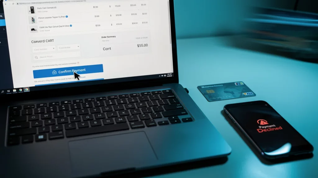
Your customers are ready to buy. Then something goes wrong, and they leave without completing the purchase. The payment abandonment rate across e-commerce sits between 60% and 80%, meaning most online transactions never finish.
At Schedly, we've identified the real reasons why this happens. It's not random-it's friction in your checkout process, trust issues, and technical problems that drive customers away.
What Stops Customers at Checkout
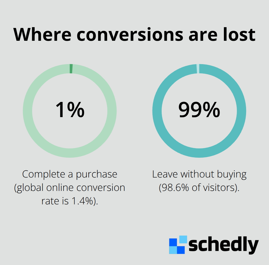
The global average online conversion rate sits at just 1.4%, according to Statista. That means 98.6% of visitors leave without buying. The culprit isn't always a product problem-it's what happens in the final moments before payment.
Simplify Your Forms
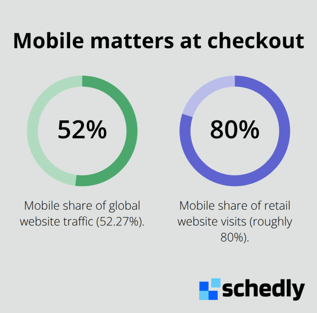
Most checkout forms request too much information. A phone number, company name, and shipping preferences aren't necessary when you only need an address and email. Statista data shows that mobile makes up roughly 80% of retail website visits, yet many businesses still use desktop-optimized forms on mobile devices. A form with five fields on a phone screen becomes a frustrating experience where customers scroll endlessly. Simplify ruthlessly. Request only what you absolutely need to process the order and deliver the product. If you want additional information for marketing purposes, collect it after the transaction completes. A two-field checkout (email and payment method) will always outperform a ten-field checkout.
Display All Costs Upfront
Customers expect transparency. When shipping costs, taxes, or processing fees appear only at the final step, you've broken trust. The customer mentally calculated a price, and now it's higher. They leave. Show all costs upfront-at the product page or at the start of checkout, not at the end. This applies equally to subscription services. If there's a setup fee, cancellation fee, or automatic renewal, state it clearly before the customer enters their payment information. Ambiguity doesn't drive conversions; it drives abandonment.
Offer Multiple Payment Methods
Digital wallets are now the most used payment method in e-commerce globally, according to Statista. Yet many checkout flows still force customers to enter a card manually. Offer PayPal, Apple Pay, Google Pay, and other wallet options to remove friction significantly. Different customer segments prefer different methods. Younger shoppers gravitate toward digital wallets and buy-now-pay-later options. Canadians increasingly use Interac e-Transfer and account-to-account payments, with 61 per cent accepting Interac e-Transfer payments. If your checkout doesn't match how your customers want to pay, you're leaving revenue on the table. Integrate multiple gateways (Stripe, PayPal, and Braintree all support diverse payment methods). The friction of forcing a customer into a single payment method isn't worth the operational simplicity.
Trust issues compound these checkout problems. Customers won't complete transactions with businesses they don't believe in, and security concerns run deeper than most merchants realize.
Why Customers Don't Trust Your Checkout
Customers abandon transactions when they question whether their payment information is safe. According to Stripe, false declines cost merchants revenue-legitimate transactions rejected by banks or processors-and erode customer trust. The inverse problem cuts deeper: customers who fear their data will be stolen won't complete payment at all. Security concerns rank among the top reasons transactions fail, yet many businesses rely on generic trust signals or outdated security practices.
Display Your Payment Processor Clearly
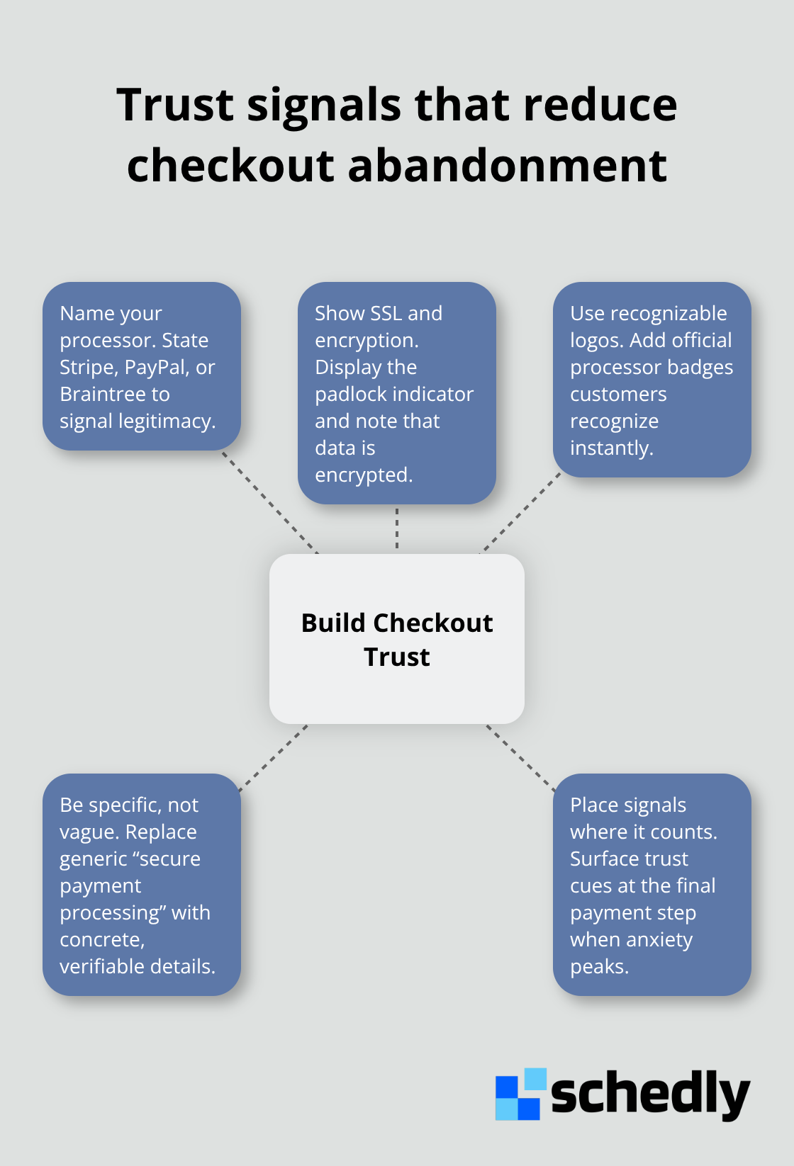
The fix isn't complicated, but it requires specificity. State exactly which payment processor handles transactions. Stripe, PayPal, and Braintree are recognized names that signal legitimacy. If your checkout mentions only a vague phrase like "secure payment processing," customers have no reason to believe you. Add the processor's logo and mention it by name. Include an SSL certificate indicator (typically shown as a padlock icon in the browser bar) and state that data is encrypted. Customers notice these details in the final moments before payment. A missing security badge or unclear language about data handling creates doubt that stops transactions cold.
Make Your Return Policy Crystal Clear
Return policies and refund clarity matter equally. When a customer cannot find your return policy or it reads like legal jargon, they assume the worst. State your return policy in plain language before checkout, not buried in a footer. For example, say "30-day returns with full refund" rather than vague language about eligibility windows. Mention your refund timeline explicitly-how many business days until money returns to their account. If you offer a money-back guarantee displayed at checkout, place it prominently before payment, not after.
Highlight Secure Payment Options
Canadians increasingly use account-to-account payments like Interac e-Transfer, which offer secure transfers without revealing card details. Highlight multiple secure payment options to reinforce that you respect customer preferences and protect their information. Trust signals must be visible and specific, not assumed. The goal is eliminating doubt at the exact moment the customer decides whether to complete the purchase.
Technical problems compound these trust issues. Even when customers trust you and want to buy, slow pages and confusing interfaces stop them cold.
Mobile Experience and Technical Issues
Mobile devices account for 52.27% of global website traffic, yet most businesses optimize their checkout experience for desktop screens first. The result is predictable: customers on mobile devices encounter forms that don't fit their screen, buttons they can't tap accurately, and pages that load slowly enough to trigger abandonment. This means your mobile checkout isn't optional-it's where most of your revenue either completes or disappears.
Test Checkout on Real Mobile Devices
A customer who navigates your site perfectly on desktop will abandon the transaction on mobile if the checkout form requires horizontal scrolling or if payment buttons are misaligned. Test your checkout on actual phones, not just browser emulators. Load times matter intensely at this stage. Transactions fail when pages load slowly or when technical glitches interrupt the payment process. A two-second delay in page rendering led to about a 4% loss in revenue per visitor. If your payment gateway takes more than three seconds to respond after a customer enters their card information, they'll assume the transaction failed and close the browser.
Implement Progress Indicators During Payment
Implement a progress indicator during payment processing so customers know their transaction is working, not stuck. Speed isn't a nice-to-have feature in checkout-it's a conversion requirement. Customers won't tolerate waiting without feedback when they're ready to complete a purchase.
Clarify Navigation and Field Labels
Navigation and labeling problems create friction that customers won't tolerate when they're ready to complete a purchase. Confusing checkout flows with unclear next steps, poorly labeled payment fields, or ambiguous button text (Continue vs. Next vs. Proceed) force customers to pause and think rather than act. Your checkout should be self-explanatory without requiring customer support.
A customer shouldn't wonder whether they're entering their billing address or shipping address. Field labels should be explicit and positioned above input boxes, not inside them, because placeholder text disappears when customers start typing. The payment method selector should show which option is selected and what fees apply to each method.
Display Security Information During Payment
One practical improvement is displaying security information inline during payment-showing that Stripe or PayPal is processing their transaction removes the anxiety that creates last-minute abandonment. Test your checkout with real users who've never seen it before, not with team members who know how it works. Watch where they hesitate, click back, or refresh the page. Those friction points are where revenue leaks.
Final Thoughts
Payment abandonment costs your business real revenue, and the payment abandonment rate between 60% and 80% proves that friction, trust gaps, and technical failures stop transactions at every stage. You can recover this lost revenue through concrete changes: simplify your forms to two or three essential fields, display all costs upfront before customers enter payment information, and integrate multiple payment gateways so customers pay their preferred way. Mobile optimization and fast page load times remove the technical barriers that stop customers in their final moments, while trust signals like processor logos and transparent return policies address the core reasons transactions fail.
Start today by testing your checkout on actual mobile devices and measuring where customers drop off. Remove unnecessary form fields, add trust badges and security information during payment, and integrate Stripe, PayPal, or other processors that customers recognize. These changes compound quickly-a business that reduces friction at checkout recovers abandoned transactions, builds customer loyalty, and increases lifetime value without requiring expensive marketing campaigns.
If you manage appointments, bookings, or client payments, Schedly streamlines how clients schedule and pay with secure payment processing and 24/7 online booking. Removing friction from your payment process accelerates your revenue cycle and eliminates the administrative overhead that slows transactions down.