
Schedly resources
Why Your Booking Page Fails on Smartphones
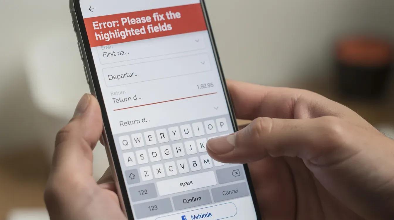
Over half of all booking attempts happen on smartphones, yet most businesses still design their booking pages for desktop screens first. This disconnect costs you real revenue.
At Schedly, we've seen firsthand how a poor mobile booking experience tanks conversion rates. The good news: fixing it doesn't require a complete redesign.
What's Actually Breaking Your Mobile Bookings
Page Speed Kills Conversions Before Users Even See Your Form
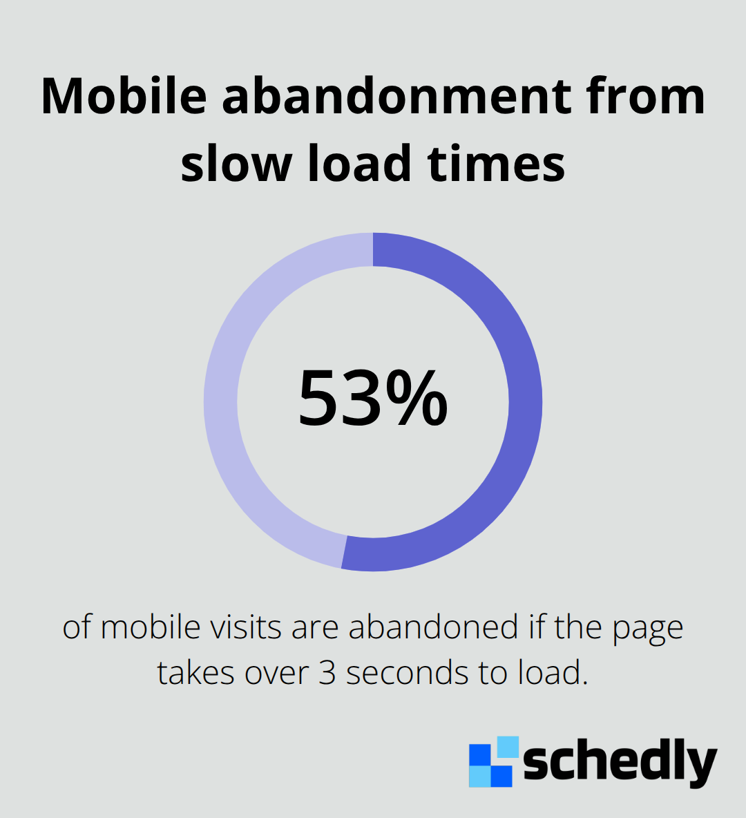
Mobile users abandon booking pages that take more than three seconds to load. 53% of mobile visits are abandoned if the page takes over 3 seconds. Your desktop-optimized images, unnecessary scripts, and uncompressed assets bleed revenue on phones.
Forms Need Mobile-Specific Architecture
Desktop forms with fifteen fields before checkout tank conversions on small screens. Mobile users see a wall of input boxes, get frustrated by tiny touch targets, and abandon the flow entirely. Reduce your form to the absolute essentials before payment.
Ask for email and phone number, not address history and company affiliation. Pre-fill what you already know from their account. Make each field span the full width so users can actually tap them without precision. Implement inline validation so errors appear immediately without forcing a page reload. If you need multi-step checkout, use a progress indicator showing users exactly where they are in the process.
Studies of booking sites show that reducing form fields increases conversion rates significantly. The key is ruthlessness: every field you keep should earn its place through genuine necessity, not habit or "nice to have" data collection.
Payment Processing Requires Real Device Testing
Your payment gateway might work flawlessly on your laptop but fail silently on iPhones or Android devices. Test every payment method on actual phones, not browser emulators. Sticky buttons that remain visible during scrolling prevent users from losing sight of the checkout action.
Show the full price upfront and include a clear breakdown of what's included before users hit submit. Autofill payment fields wherever possible, and allow users to edit their information without forcing them to restart the entire form. Real-world testing reveals that UX and pricing-transparency problems like cost surprises, forced accounts, slow checkout, unclear totals, and site errors drive mobile abandonment, yet many businesses never test their checkout on the devices their customers actually use.
These three areas-speed, form design, and payment processing-represent the biggest friction points in your mobile funnel. But identifying the problems is only half the battle. The real gains come from knowing exactly where your users drop off and what specific changes move the needle.
The Three Mistakes That Kill Mobile Conversion
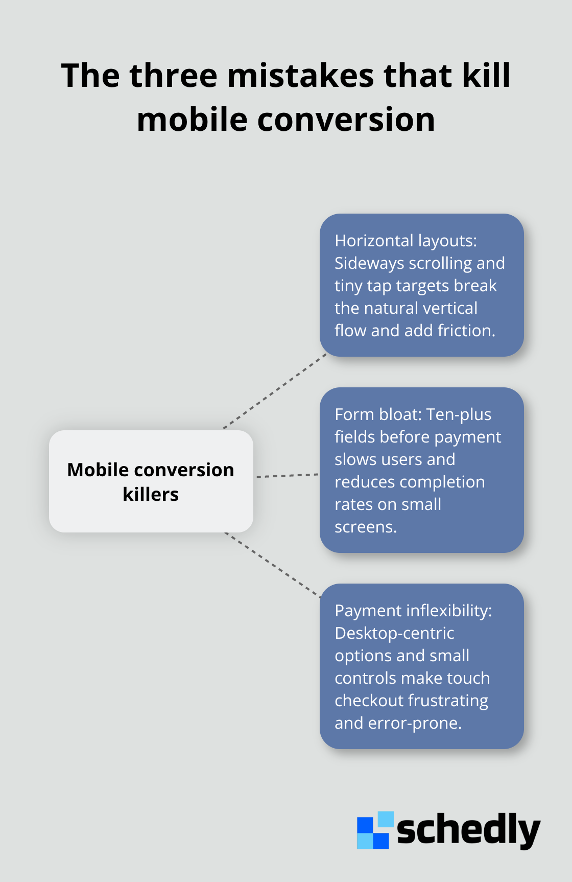
Most businesses make the same preventable errors when they adapt their booking pages for mobile. The first mistake is architectural: they force users to scroll horizontally or navigate through desktop-style menus that require precision taps on tiny touch targets. Horizontal scrolling signals poor design to mobile users, who expect vertical scrolling as the natural interaction pattern. The second mistake is form bloat. Businesses keep every field they use on desktop, asking for billing address, company name, preferred contact method, and a dozen other details before users reach checkout. Each additional field reduces completion rates.
Vertical Design Beats Horizontal Every Time
Horizontal scrolling on mobile signals that your layout was never designed for small screens. Users expect to scroll down, not sideways. If your calendar widget, time slots, or service selection requires horizontal swiping, you force extra cognitive load and create friction at the exact moment users try to book. Aggressive simplification solves this: show only what fits on screen vertically, use collapsible sections instead of side-by-side layouts, and stack all elements in a single column. When you test this on real devices, you notice that users navigate faster and abandon less frequently. Mobile-first design means your smallest screen defines your layout, not your largest.
Form Fields Are Not Data Collection Opportunities
Businesses that require ten or more form fields before payment see mobile conversion rates that are measurably lower than those with three to five essential fields. The temptation to collect comprehensive customer data at booking time costs you sales. Capture email and phone number. Pre-fill everything else from the customer's account if they log in. Ask for address information only after the booking is confirmed. Inline validation that shows errors immediately (without forcing page reloads) prevents frustration and reduces abandonment caused by unclear validation messages. Each field you remove before checkout increases conversion rates.
Payment Methods Must Work on Touch Devices
Test your payment processing on actual iPhones and Android phones, not in browser emulators. Many payment gateways render differently on real devices, and small buttons that work fine with a mouse become impossible to tap accurately on a phone. Sticky checkout buttons that remain visible while users scroll through order details prevent the common mobile mistake of users losing sight of where to complete their purchase. Show the full price and a breakdown of costs before users submit payment. Autofill every field possible, and allow users to edit information without restarting the entire form. Real device testing reveals that users abandon mobile checkouts when they encounter unexpected costs, unclear pricing, or payment flows that feel clunky compared to the rest of the booking experience.
These three architectural problems create compounding friction. But the real question is whether you know exactly where your mobile users drop off and what specific changes actually move the needle on your conversion rate.
How to Fix Your Booking Page for Mobile Users
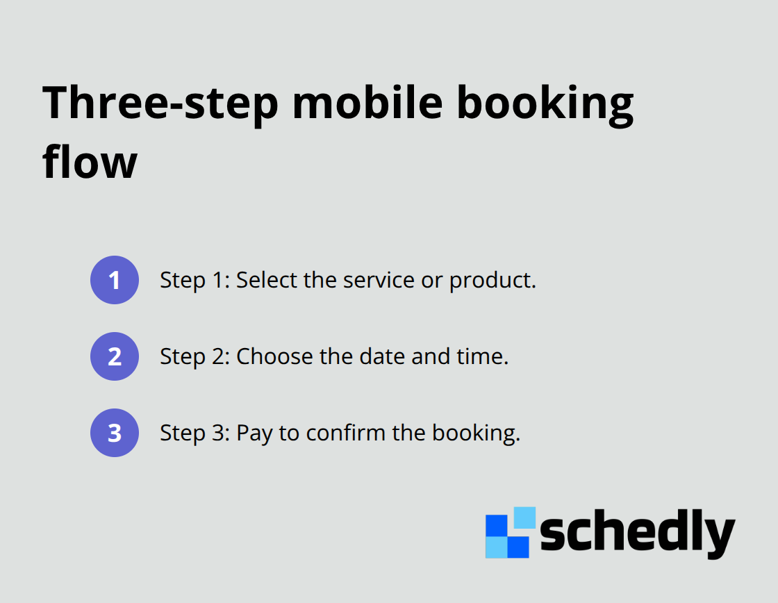
Strip your booking flow down to the absolute essentials. Most businesses require users to navigate five, six, or even seven distinct steps before payment, when research shows that three steps or fewer dramatically improves completion rates.
Test on Actual Devices, Not Emulators
Open your booking page on an iPhone 13, a Samsung Galaxy, and a mid-range Android device. Not in browser emulators. Not in your office on fast WiFi. Download a network throttling tool and simulate real 4G speeds, which is what most mobile users experience. Payment gateways render differently on real phones than in simulators, and buttons that feel easy to tap on a desktop become impossible to hit accurately on a phone. Use FullStory or similar session recording tools to watch how real users interact with your mobile booking page-where they click, where they hesitate, where they abandon. Heatmaps show you exactly which elements users tap most and which areas they ignore. This data reveals whether your form fields are actually accessible or whether users struggle with tiny touch targets. Conduct usability testing with five to ten actual mobile users attempting to complete a booking, and you will identify friction points that analytics alone never reveal.
Redesign Around Touch, Not Mouse Interaction
Mobile-first design means your smallest screen defines your entire layout, not your largest. Radio buttons for payment methods need to be at least 24 by 24 CSS pixels so thumbs can tap them reliably. Text inputs should span the full width of the screen. Dropdown menus that work fine on desktop become clunky on mobile because they require precision taps and multiple interactions. Replace them with full-width button groups or segmented controls that users can tap easily. Autofill payment fields wherever payment gateways allow it-users should never manually type their credit card number on a phone if your system can fill it automatically. Inline validation that appears instantly as users complete each field prevents the frustration of submitting a form only to discover a required field was missed. Allow users to edit their information without forcing them to restart the entire booking flow. Each interaction should feel natural on a touchscreen, not like a desktop experience squeezed onto a phone.
Final Thoughts
Your mobile booking experience directly determines whether visitors complete purchases or abandon your site. A three-second page load, a five-field form, and a sticky checkout button aren't luxuries-they're the difference between revenue and lost sales. The businesses winning right now test small changes on real devices, measure what moves the needle, and iterate continuously rather than waiting for perfect redesigns.
Open your booking page on an actual smartphone using 4G speeds, not your office WiFi. Watch where you hesitate or struggle, time how long the page loads, and count your form fields before payment. If any of these metrics feel clunky, your mobile users experience the same friction you just felt, and they drop off instead of booking.
Quick wins compound: removing three unnecessary form fields lifts conversion by 8 to 12 percent, fixing your page load time from six seconds to two seconds prevents abandonment before users see your form, and a sticky checkout button keeps your call-to-action visible while users scroll through pricing details. If you manage multiple team members, locations, or complex scheduling workflows, Schedly automates the entire booking process with a mobile-optimized scheduling page, secure payment processing, and real-time availability management. Test your page today on a real device, identify your biggest friction point, and fix it this week.