
Schedly resources
What's Preventing More Visitors From Scheduling Appointments

Your booking conversion rate depends on more than just having a scheduling tool. Most businesses lose potential customers at predictable points in the appointment-booking process.
At Schedly, we've identified the specific friction points that stop visitors from completing their bookings. This post walks through the barriers holding you back and how to remove them.
What Stops Visitors From Completing the Booking Form
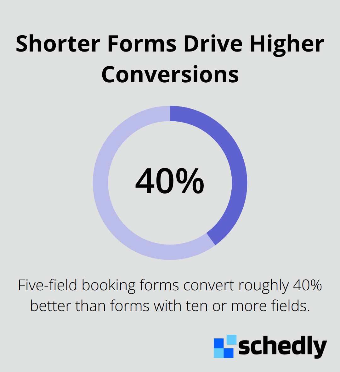
Most visitors abandon the booking process before they finish. Nielsen Norman Group research shows that each additional form field increases drop-off rates significantly. Businesses with five-field forms convert roughly 40% better than those asking for ten or more fields. The culprit is friction.
Simplify Your Form to Essential Fields Only
Ask only for name, email, phone, and preferred time. Everything else can wait until after confirmation. Real-time form validation matters too. When visitors see errors immediately instead of after submission, they fix issues on the spot rather than abandoning the page. Test your current form by removing any field that isn't essential to scheduling the appointment itself. Each question you remove lifts your completion rate.
Mobile Experience Determines Conversion Success
Around 52.27% of global web traffic comes from mobile devices, yet most scheduling pages still feel like desktop afterthoughts. Slow load times destroy conversions. Google research shows that pages loading in under 3 seconds perform significantly better. Mobile scheduling pages must load in under two seconds.
Large tap targets matter more than you think. Buttons and date pickers need to be at least 44 by 44 pixels to avoid mis-clicks. Calendar widgets should display one month at a time on mobile, not three months squeezed into a tiny screen. Single-column layouts work better than multi-column designs on phones. Horizontal scrolling frustrates users and signals poor design. Test your scheduling page on actual mobile devices, not just browser emulators. Many businesses discover their calendar interface becomes unusable below 768 pixels wide. Prioritize mobile-first design, simplify the calendar view, and ensure every interactive element works with thumbs, not mouse cursors.
Transparency About Cost Removes Hesitation
Hidden pricing kills bookings. Visitors want to know the full cost before they commit time to scheduling. If your appointment page doesn't clearly state pricing, cancellation policies, or what the service includes, expect abandonment. Some businesses hide pricing to seem flexible, but this strategy backfires. Transparency builds trust.
Display the service duration, total cost, and any preparation requirements right on the booking page. If pricing varies by appointment type, show that breakdown clearly. Cancellation policies should be visible before confirmation, not buried in fine print after booking. Make pricing decisions easy by limiting appointment types to your top five offerings. Too many options create decision fatigue and increase abandonment. When visitors see a long list of service variations with unclear pricing, they often close the tab rather than click through.
Build Trust Before Visitors Book
Visitors hesitate when they don't know who they're booking with or whether their payment information is safe. This hesitation directly impacts your conversion rate. The next section covers the trust signals that turn hesitant visitors into confirmed appointments.
Why Visitors Don't Trust Your Booking Page
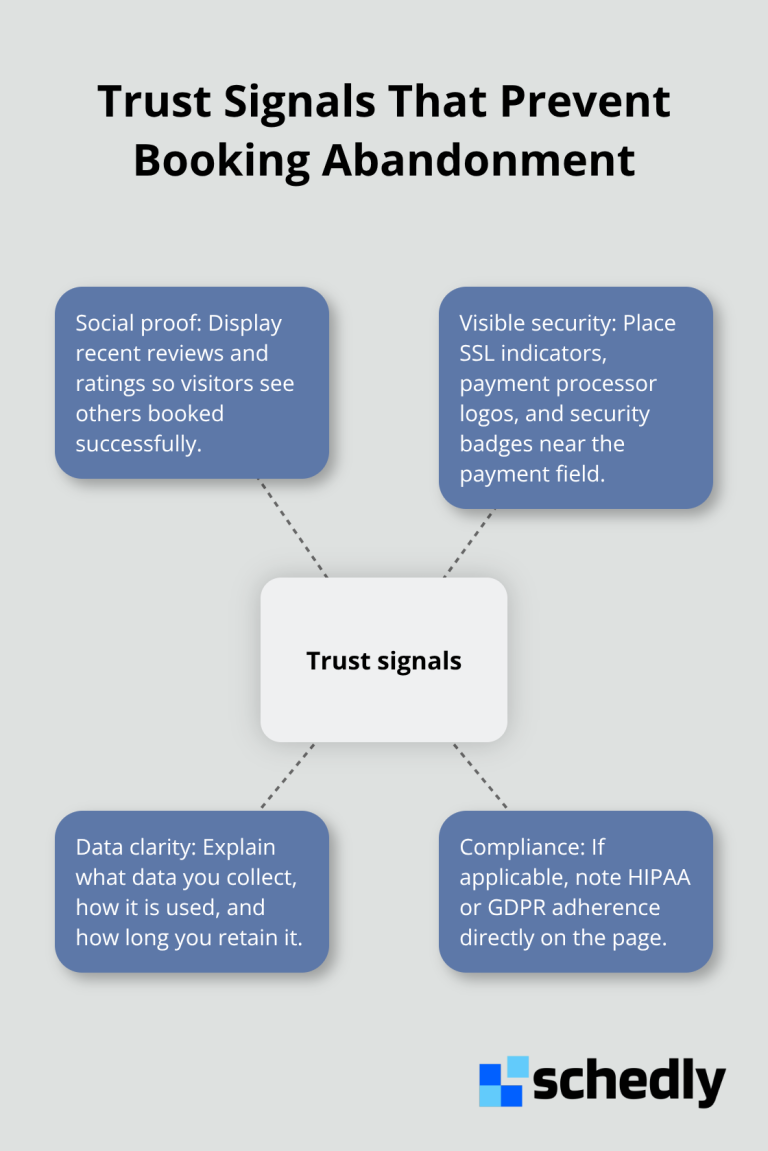
Visitors abandon booking pages when they doubt whether their information is safe. Research shows that positive reviews significantly increase consumer trust, yet most scheduling pages display zero social proof. This gap between expectation and reality costs you conversions. Visitors need three things before they hand over payment details: proof that others booked successfully, visible security measures, and clarity on how their data gets handled.
Display Security Signals Where They Matter Most
Your payment form needs visible trust markers. An SSL certificate is table stakes, but visitors don't know you have one unless you show the padlock icon in the address bar. That's not enough. Add trust badges and security certifications directly on your booking page, near the payment field. Norton Secured, McAfee Secure, or similar badges reduce checkout abandonment because they're visual proof of protection. If your scheduling tool integrates with Stripe or PayPal, display their logos prominently. Visitors recognize these payment processors and trust them.
Your privacy policy must be accessible with a single click from the booking page, not buried three levels deep in your site footer. State explicitly how you handle payment information, what data you store, and how long you retain it. If you're HIPAA-compliant or follow GDPR standards, mention that directly on the page. Visitors in regulated industries want confirmation that you understand their compliance needs.
Test your current booking page by asking yourself: could a first-time visitor immediately identify three security measures? If the answer is no, you're losing conversions to doubt.
Leverage Customer Reviews to Overcome Hesitation
Testimonials work, but specific reviews convert better. Generic praise like "great service" doesn't move the needle. Instead, feature reviews that mention the actual appointment experience. For example, a review stating "booked in two minutes and the appointment started exactly on time" tells prospects what they'll experience. Display at least three to five reviews on or near your scheduling page.
If you have ratings on Google, Yelp, or Trustpilot, embed them directly into your booking interface. Visitors checking your appointment availability simultaneously see your star rating and recent feedback. This combination builds confidence fast. If you lack reviews, ask recent customers for feedback immediately after their appointment. Send a follow-up email with a direct link to your review platform. Practices with five or more reviews see significantly higher booking completion rates than those with none.
Build Credibility Through Staff Credentials
Staff credentials matter significantly. If your business involves health, legal, or financial services, display your team's qualifications, certifications, and experience directly on the booking page. A visitor scheduling with a licensed therapist feels more confident than one with no context about who they're booking with. Include staff photos alongside credentials. Faces humanize the experience and reduce the psychological distance between visitor and provider.
When prospects see who they'll work with before they book, hesitation drops. They move from abstract uncertainty to concrete confidence. This shift from doubt to trust happens fast when you present credentials prominently. The next section covers how your calendar interface itself can either accelerate or block the booking decision.
Why Your Calendar Interface Loses Bookings
Your calendar widget stands as the biggest obstacle between visitor interest and completed appointment. Most scheduling pages display calendars that frustrate rather than guide. Visitors encounter time zone confusion, unclear availability indicators, and overwhelming option density that pushes them toward abandonment. The calendar isn't just a nice-to-have interface element-it's the conversion bottleneck where hesitant prospects make their final decision. When your calendar feels clunky or ambiguous, visitors close the tab. A well-designed calendar removes friction and accelerates the booking decision.
Time zone mismatches destroy bookings silently
A visitor in Los Angeles books a 2 PM appointment thinking it's their local time, only to discover it's 5 PM Eastern. They cancel or never show up. This friction costs you revenue and reputation. Your calendar must display time zones prominently and auto-detect the visitor's location. If your business serves multiple time zones, show the conversion automatically rather than forcing visitors to calculate manually.
Many scheduling tools fail here. They display times in your business timezone only, leaving remote visitors confused. Automatic local-time conversion prevents this costly mistake. Visitors always see their own time zone without confusion or manual effort.
Availability Display Shapes the Booking Decision
Visitors want to see at least two weeks of open slots at a glance, not hunt through a month-by-month view. Dense calendars with too many visual cues create decision fatigue. If every day shows multiple appointment types with different colors and symbols, visitors struggle to find what they need.
Simplify your availability display. Show only available time slots in a clear color, and gray out booked times. Avoid using more than two colors on your calendar. If you offer multiple appointment types, let visitors filter by type rather than showing all options simultaneously.
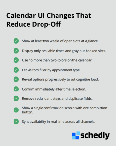
Booking confirmation must happen immediately after time selection. Too many scheduling systems force visitors through additional steps-selecting appointment type again, filling redundant forms, or reviewing information they already provided. Each extra step increases abandonment. When a visitor clicks a time slot, the next screen should show only the essential confirmation details and a single button to complete booking.
Real-time inventory updates matter too. Your scheduling system must update availability in real-time across all channels so no visitor encounters the unavailable-slot surprise.
Integration Gaps Create Manual Work and Errors
Your scheduling page exists in isolation if it doesn't sync with your actual business operations. A visitor books an appointment, but your staff calendar doesn't update automatically. Your payment processor receives the booking, but your CRM doesn't record the customer. These integration gaps create manual work, human error, and missed opportunities.
Staff scheduling conflicts happen when your online booking system doesn't talk to your employee scheduling system. A visitor books with an employee who's marked unavailable that day, creating scheduling chaos. This error damages customer experience and wastes staff time resolving conflicts. Your scheduling tool must pull real-time staff availability from your actual scheduling system, not display a static availability list that goes stale.
Your booking system should populate customer data directly into your CRM so your team has context before the appointment. When staff see a customer's booking history, preferences, and previous interactions, they provide better service. This integration transforms booking from an isolated transaction into a connected customer journey that improves retention and lifetime value. Scheduling software with built-in integrations for Google Calendar, Zoom, Stripe, PayPal, and Salesforce ensures your booking flows directly into your existing systems without manual entry or data loss.
Final Thoughts
Your booking conversion rate improves when you fix the specific friction points that stop visitors from completing appointments. The barriers are predictable: complicated forms, slow mobile experiences, unclear pricing, missing trust signals, confusing calendars, and broken integrations. Each one costs you conversions, but removing these obstacles doesn't require a complete redesign-start by auditing your current booking page against these friction points, simplify your form to four essential fields, test your calendar on actual mobile devices, add security badges and customer reviews near your payment field, and display pricing transparently before confirmation.
We at Schedly designed our platform specifically to remove the obstacles that kill bookings. Our scheduling tool includes a branded booking page optimized for mobile, real-time availability syncing across all channels, secure payment processing through Stripe and PayPal, and integrations with Google Calendar, Zoom, and Salesforce so your bookings flow directly into your existing systems. You also get an advanced analytics dashboard to track which friction points cost you the most conversions.
Identify which friction point costs you the most bookings right now-is it mobile experience, trust signals, or calendar confusion? Fix that first, then move to the next barrier. Visit Schedly to see how our platform handles these conversion killers automatically, so your team can focus on delivering excellent service instead of managing scheduling chaos.